Subtle Inset Styles
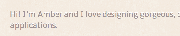
It's the mark of a great designer when someone comes to your site and knows it looks good, but doesn't know why. I love using subtle styling in my designs and one of my favorites is applying inverse drop shadows to give the appearance that something is inset.
Take my portfolio, for instance. If you look carefully, you'll notice that the text has a thin white outline on the top of the text to make it look carved in:
How do you achieve this, you ask? Simple, just add the following style to your text - you can adjust the colors, blur, and position of the shadow to your own tastes.
p {
    text-shadow: white 0px -1px 0;
}
Another type of subtle styling I love is inset styling for text fields. I don't really like the standard UI for browser text fields, so I always override it (border: 0px; outline: none; for the win!) and apply my own minimalistic styling.
I've always really enjoyed the subtle inset style on Grooveshark's login fields (they use background images), but only recently discovered the CSS way of doing it, with box shadows. Well, I won't keep you in suspense any longer; here it is:
input.field {
    box-shadow: inset 0 1px 1px 1px #dedede;
}
Don't forget to add the -webkit and -moz prefixes to make sure your code is cross browser compatible! When done correctly, it should look like this:
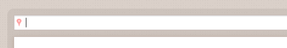
(That's a sneak peek of something new I'm working on!)